Home

Home
"There are places I remember all my life." The Beatles

Thursday, April 11, 2013

Playing around with Photoshop!

I really enjoyed this assignment playing around with Photoshop. I followed a tutorial to create this water graphic, and im really happy with how it turned out!


For this graphic i half followed a tutorial and half completed it on my own. it is just a simple swirl picture, but i had a lot of fun creating it, and it meant i had to work with duplicating, lightening and merging layers, something i had not yet experienced but now feel comfortable with!

Wednesday, April 10, 2013

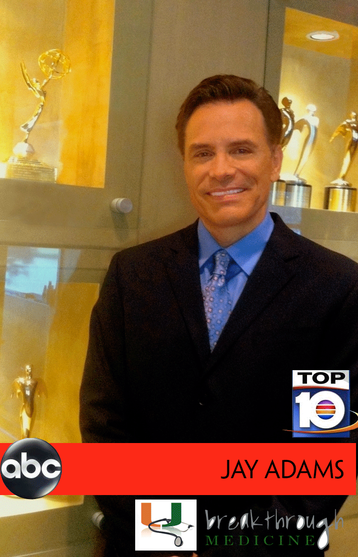
Jay Adams!

I found this hard in some parts. I traced the breakthrough in illustrator, and could then not figure out how to not have it filled with white! other than that i am okay with how it looks, it is just very crowded!

Thursday, April 4, 2013

Spending some time with the Queen

I found this project quite hard, as it is the first time I have really used photoshop! As a result of this i ended up making about 5 different pictures! i have always loved this picture of the Queen, so i thought i would try and place myself in it! i found the lighting particularly hard, i changed some of the colours and tones of the picture of my, but it still did not fully match the picture. I am reasonably happy with how this turned out.

Sunday, March 31, 2013

A Rose


This is my new image. i really enjoyed making this one, even though it took me a long time! I am really happy with the way this turned out, especially the background. Below is the image i copied.

Wednesday, March 20, 2013

exquisite corps

This is my completed exquisite corps, i had a lot of fun with this project, i found making the head and the face the most fun. it didnt turn out quite how i had hoped, especially the bottom of the tail, but i found that particularly challenging. Im looking forward to the next project!

Wednesday, March 6, 2013

I chose to keep my design a lot more simple than many of the sketches I originally created. When experimenting. I also found creating a tea cup that was not full complete lines created more of the sort of image I was looking for. I felt the incomplete cup and the hit of a saucer made the image look more elegant. I chose to use a gold color because i also felt that this was elegant and perhaps a color-scheme i could carry on within the shop maybe on the napkins etc. I experimented with a lot of different fonts, first starting with one classically more elegant in more of an italic calligraphy style, however i found this did not work as the text needed to contrast the lines of the cup and the swirls of heat so as not to simply blend i. This text i chose was easy to see upon zooming out, and with the gold outline on the black still kept it elegant in an old fashioned text. Inside i chose to place traditional afternoon tea shop, which although is small and cannot be seen upon zooming out, specifies exactly what the company is should a person choose to look more closely. Finally the last thing i added was the swirls of steam. The logo did not look complete with writing over the cup, it needed something above the writing to bring it together. At this point i looked up a lot of tea shop logos, and almost all of them seemed to have a hint of some sort of steam so i played around with swirls in all shapes and sizes to find ones that worked. originally the swirls aimed outwards, however i found when they swirled inwards it brought the picture together. The swirls brought the logo together and added a further elegant touch. when putting it together i found that making it less swirled and less hectic and italic was actually more elegant. overall i was happy with how my logo turned out, and i think it gives off the theme and feeling i was looking for.

Monday, March 4, 2013

Calligramme

This is the chinese character for love of passion. i chose to do this as my calligram because i studied chinese for many years and this was always my favorite character. To the chinese it is a vey beautiful word that encompasses all forms of love. I chose to fill it with the word love, and words about love, including many famous quotes. I think it turned out successfully except in the very bottom where the words overlap, as i could not figure out how to stop this happening. It is based upon the character at the top.